A range slider is a type of input field that allows users to select a value within a specified range by sliding a handle or marker along a visual slider track.
Table of contents:
Plugin Installation
Download it here: https://add-ons.org/plugin/gravity-forms-range-slider-field/
Once you’ve downloaded a plugin, you’ll need to install it on your website. Log into your WordPress admin dashboard. Navigate to the “Plugins” section and click on “Add New.” Search for the plugin by name and click “Install Now” once you find it.
After installation, click on “Activate” to activate the plugin.
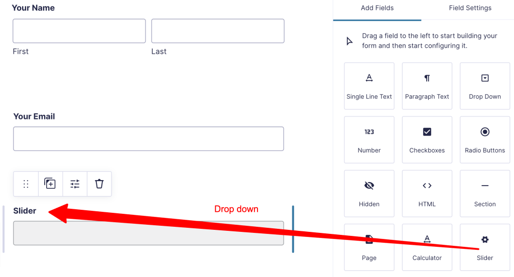
How to add a range slider to your form?
Step 1: Create a new form.
Step 2: Navigate to Add Fields – Drag and drop the Slider button.
After adding the range slider field, you can customize its settings. You can adjust the range values, step size, labels, and other appearance options depending on your requirements.
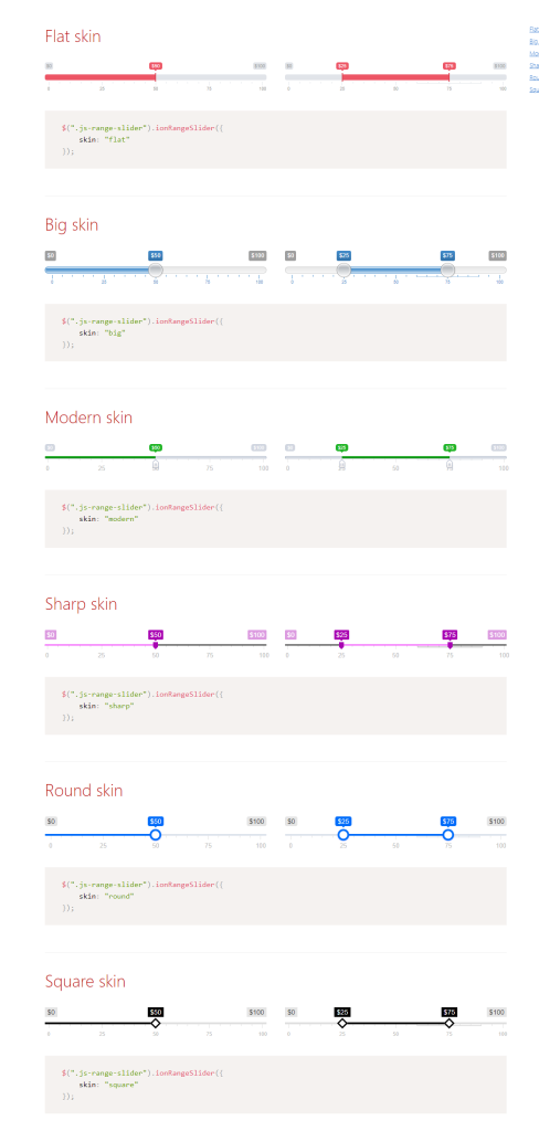
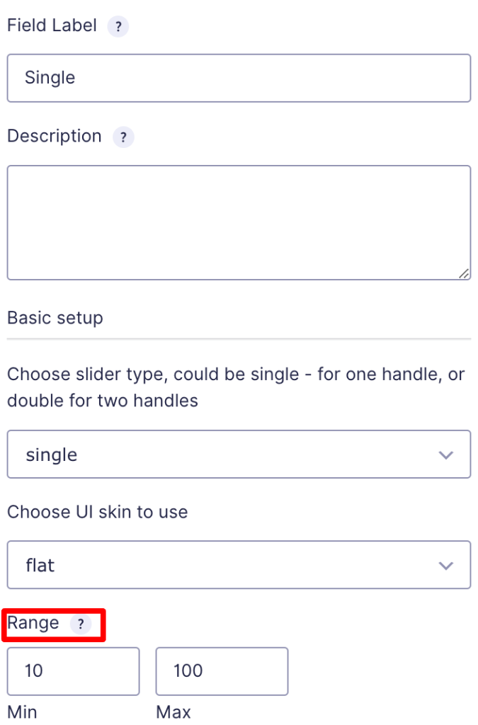
Range slider settings
UI Skin to use
These are some skins we offer for your range sliders.
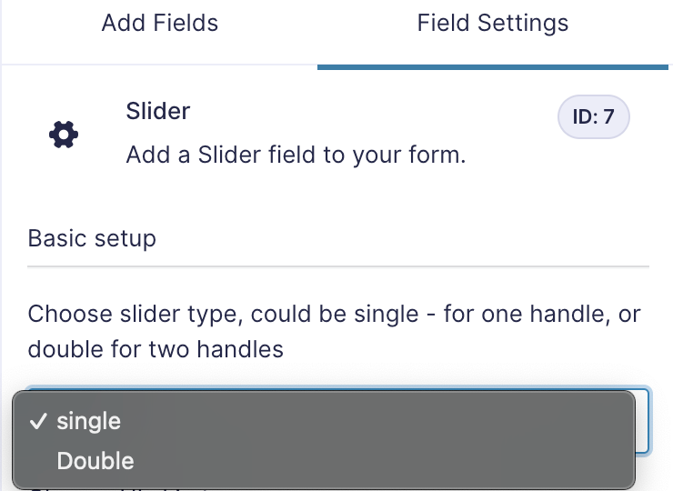
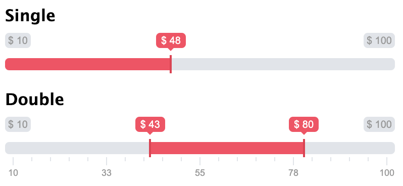
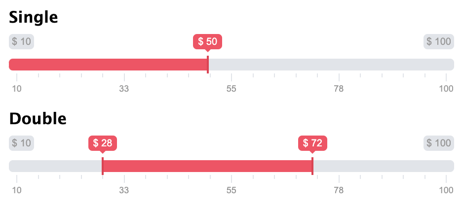
How to set single/double type?
The terms “single” and “double” refer to the number of handles or controls available on the slider. Here’s an explanation of the difference between single and double-range sliders:
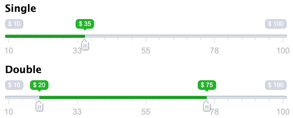
- Single Range Slider: has one handle that users can drag along the track to select a value within a predefined range. Users can position the handle anywhere within the range to indicate their desired value. Single range sliders are commonly used when you need users to select a single value within a range, such as selecting a specific price point or choosing a value on a scale.
- Double Range Slider: also known as a dual-handle range slider, features two handles that users can independently manipulate to define a range between two values. Users can customize the selected range by adjusting the positions of both handles. Double range sliders are useful when you want users to select a range of values, such as selecting a date range, specifying a budget range, or setting a range of quantities
To set, you just want to select Single or Double in the dropdown:
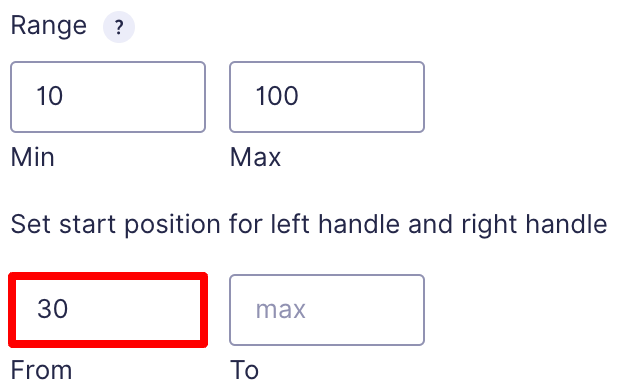
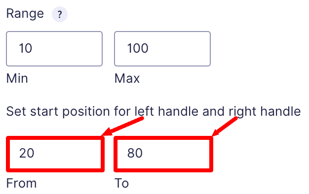
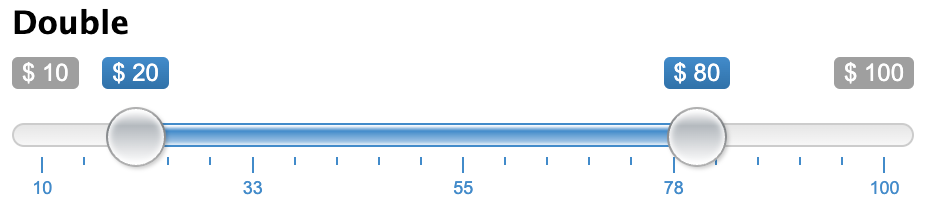
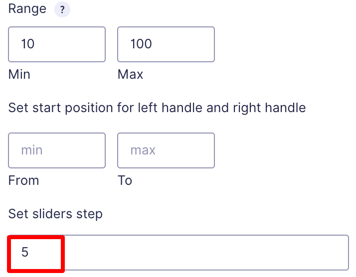
How to set min/max value, range,start point, and slider step?
- Min and Max Value: The min is the value from where the slider value will start, and the max is the value where the slider value ends. If you choose 200 as min and 1000 as max, the user can select a value in between this range.
Look for the Min/Max boxes and enter the minimum and maximum values for the range in the box.
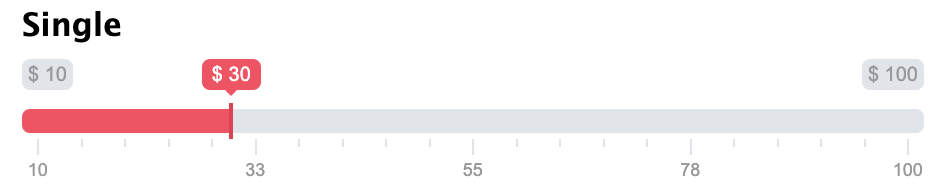
- Start points: This determines the initial position of the handles. Users can move the handles to select different values within the defined range.
Start point for Single Type: it just for the left handle
Start point for Double Type: it is for both left and right handle
- Set Slider Step: The slider step determines the increment or decrement when users slide the range slider handle. To set the step size, look for the “Step” option within the Field Options. Enter the desired numerical value for the step size.
For example, if you set the step size to 5, the slider will move in increments of 5 as users interact with it.
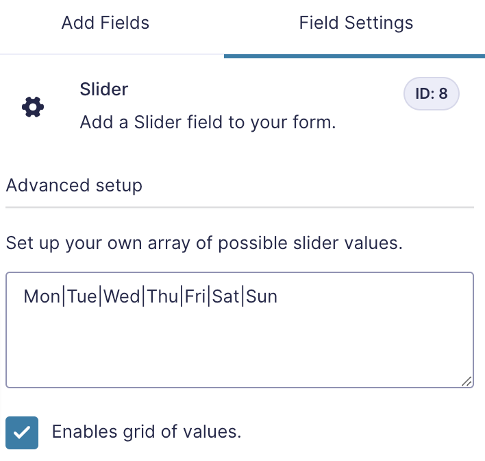
How to set custom values? (Customisable grid of values)
It means specifying a specific value or range of values (Customisable grid of values) that the user can select within the slider’s range. By setting a custom value, you can define specific points that the user can choose from, rather than allowing them to select any value within the entire range.
E.g:
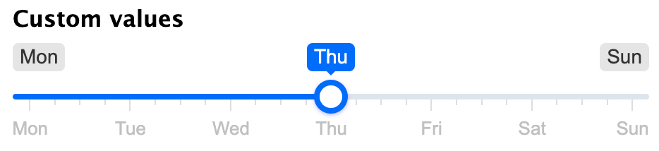
We create custom day values by typing in the check box below as format: Mon|Tue|Wed|Thu|Fri|Sat|Sun
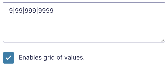
E.g:
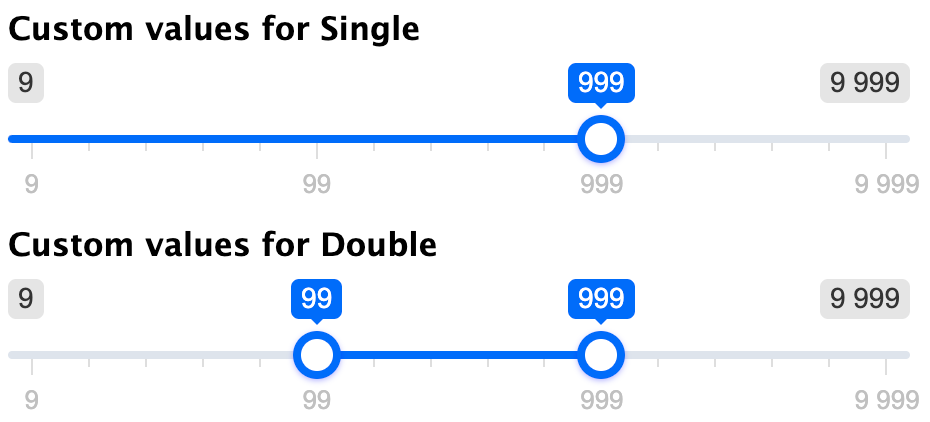
We create custom day values by typing in the check box below in the format: 9|99|999|9999
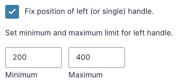
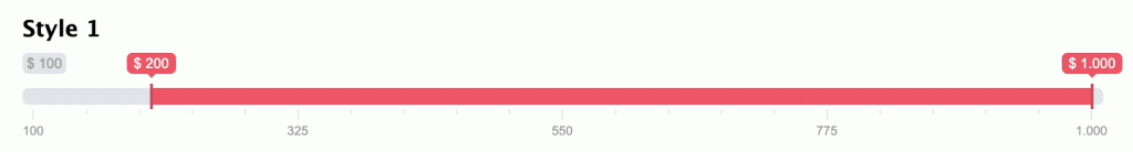
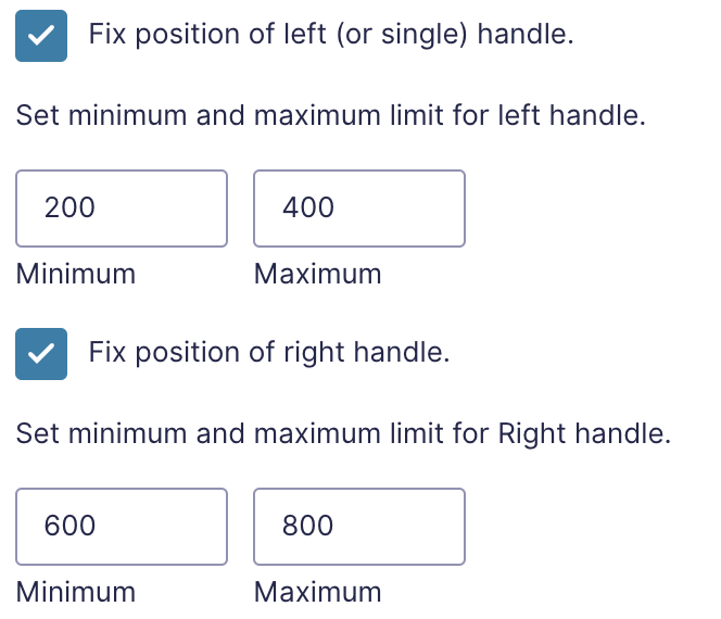
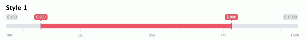
How to set handle control for Double Type?
Handle control allows you to define the starting position of the left and right handles on the slider. You can only move within this range.
For the left handles: you can move from 200 to 400
For the right handle: you can move from 600 to 800
How to set prefixes, postfixes, and your separators?
Fill the icon, text…into the blank spot.
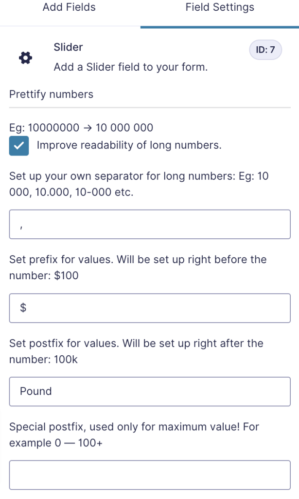
Table Settings
| Option | Defaults | Type | Description |
|---|---|---|---|
| Basic setup | |||
| typedata-type | “single” | string | Choose slider type, could be single – for one handle, or double for two handles |
| mindata-min | 10 | number | Set slider minimum value |
| maxdata-max | 100 | number | Set slider maximum value |
| fromdata-from | min | number | Set start position for left handle (or for single handle) |
| todata-to | max | number | Set start position for right handle |
| Advanced setup | |||
| stepdata-step | 1 | number | Set sliders step. Always > 0. Could be fractional. |
| valuesdata-values | Eg: 2||4|6|8 | array | Set up your own array of possible slider values. They could be numbers or strings. If the values array is set up, min, max and step param, are no longer can be changed. |
| keyboarddata-keyboard | true | boolean | Activates keyboard controls. Move left: ←, ↓, A, S. Move right: →, ↑, W, D. |
| Grid setup | |||
| griddata-grid | false | boolean | Enables grid of values. |
| grid_margindata-grid-margin | true | boolean | Set left and right grid borders. |
| grid_numdata-grid-num | 4 | number | Number of grid units. |
| grid_snapdata-grid-snap | false | boolean | Snap grid to sliders step (step param). If activated, grid_num will not be used. |
| Interval control | |||
| drag_intervaldata-drag-interval | false | boolean | Allow user to drag whole range. Only in double type |
| min_intervaldata-min-interval | — | number | Set minimum diapason between sliders. Only in double type |
| max_intervaldata-max-interval | — | number | Set maximum diapason between sliders. Only in double type |
| Handles control | |||
| from_fixeddata-from-fixed | false | boolean | Fix position of left (or single) handle. |
| from_mindata-from-min | min | number | Set minimum limit for left handle. |
| from_maxdata-from-max | max | number | Set the maximum limit for left handle |
| from_shadowdata-from-shadow | false | boolean | Highlight the limits for left handle |
| to_fixeddata-to-fixed | false | boolean | Fix position of right handle. |
| to_mindata-to-min | min | number | Set the minimum limit for right handle |
| to_maxdata-to-max | max | number | Set the maximum limit for right handle |
| to_shadowdata-to-shadow | false | boolean | Highlight the limits for right handle |
| UI control | |||
| skindata-skin | “flat” | string | Choose UI skin to use |
| hide_min_maxdata-hide-min-max | false | boolean | Hides min and max labels |
| hide_from_todata-hide-from-to | false | boolean | Hide from and to labels |
| force_edgesdata-force-edges | false | boolean | Slider will be always inside it’s container. |
| extra_classesdata-extra-classes | — | string | Traverse extra CSS-classes to slider container |
| blockdata-block | false | boolean | Locks slider and makes it inactive (visually). input is NOT disabled. Can still be send with forms. |
| Prettify numbers | |||
| prettify_enableddata-prettify-enabled | true | boolean | Improve readability of long numbers. 10000000 → 10 000 000 |
| prettify_separatordata-prettify-separator | ” “ | string | Set up your own separator for long numbers. 10 000, 10.000, 10-000 etc. |
| prettify— | null | function | Set up your own prettify function. Can be anything. For example, you can set up unix time as slider values and than transform them to cool looking dates. |
| prefixdata-prefix | — | string | Set prefix for values. Will be set up right before the number: $100 |
| postfixdata-postfix | — | string | Set postfix for values. Will be set up right after the number: 100k |
| max_postfixdata-max-postfix | — | string | Special postfix, used only for maximum value. Will be showed after handle will reach maximum right position. For example 0 — 100+ |
| decorate_bothdata-decorate-both | true | boolean | Used for “double” type and only if prefix or postfix was set up. Determine how to decorate close values. For example: $10k — $100k or $10 — 100k |
| values_separatordata-values-separator | ” — “ | string | Set your own separator for close values. Used for double type. Default: 10 — 100. Or you may set: 10 to 100, 10 + 100, 10 → 100 etc. |
| Data control | |||
| input_values_separatordata-input-values-separator | ” ; “ | string | Separator for double values in input value property. Default FROM;TO. Only for double type |
| disabledata-disable | false | boolean | Locks slider and makes it inactive. input is disabled too. Invisible to forms. |